Making beautiful slides for your talks, part 2: All about aesthetics
After I published my beginner’s guide to making beautiful slides for your talks, I got a lot of great feedback and I especially loved that others had already used it for their talks – some of which I even got to see in person! So in this post, I want to showcase two examples from the community, as well as my most recent talk, and dive deeper into the aesthetics and slide design process. Thanks to Jodie and Vicki for participating!
- 🎨 Part 1: Design tips for beginners
- ✨ Part 2: All about aesthetics
- 🛠️ Part 3: Technical content
- 🧩 Part 4: Design elements
- 💌 Part 5: Sharing your presentations
- 💜 Part 6: Community showcase
- 📚 Part 7: Resources and tools list
Disclaimer (since my previous post also got widely shared outside of my circles): This blog post series is not intended as a general-purpose guide to making universally good slides. It mostly collects some tips based on how I make my slides, which are quite specific and targeted to a certain type of conference, talk style and audience. I get a lot of questions from people who like my slides and want to do something similar for their talks, which is what inspired this post.
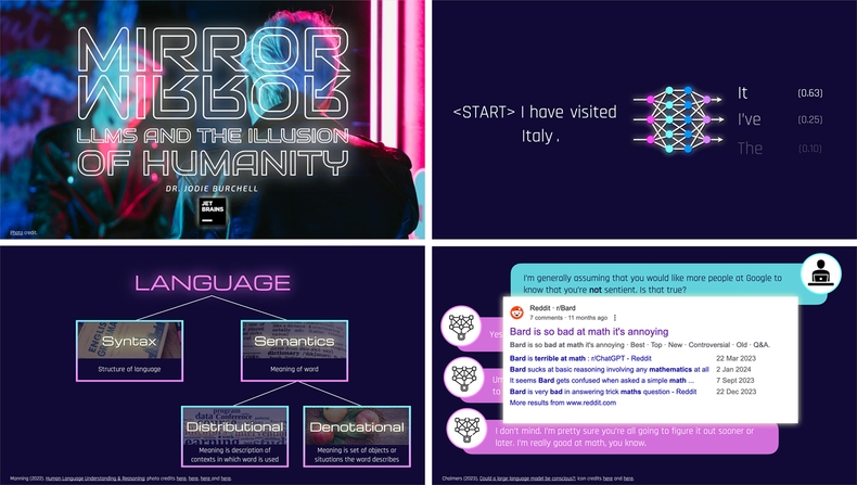
Jodie Burchell: “Mirror, mirror: LLMs and the illusion of humanity” (PyCon Italy keynote)
| ✨ Aesthetic | cyberpunk / neon / retro futuristic |
| 🎨 Colors | dark navy blue, bubblegum pink, electric blue, light violet, dodger blue, white |
| ✍️ Fonts | Audiowide (title slides), Michroma (titles), Rajdhani (body), JetBrains Mono (code), Roboto (ChatGPT slide) |
| 🛠️ Tools | Keynote, Pixelmator Pro, Digital Colour Meter |
“Due to my talk topic, I already had a “sci-fi” kind of theme in mind. Following Ines’ advice, I trawled through Google Fonts, looking for something that looked kind of retro but futuristic, and Audiowide jumped out at me. However, as this font is very distinctive and heavy I knew I’d need to use it sparingly. To get my title and body fonts, I just googled for fonts that go with Audiowide, and after a bit of trial and error settled on Michroma and Rajdhani. As I’m not great at design, I tend to google for ideas like this a lot - there are many people who have generously offered up their expertise, and you can use this to really polish your own designs.
To fit with the talk title, I started looking for “futuristic” images that involved a mirror, and fell in love with the one I used for my title slide. Once I had that, I just used Mac’s built-in Digital Color Meter to extract the different colors used in that photo, and voila! I had my color palette ready made from that!
When working out how to put together the title slide, I found a cool video where someone showed how to make a neon effect just using the built-in tools in Keynote. I messed around with this until I was happy with the result, and ended up using this quite heavily throughout the presentation. I think this additional detail (although it took ages to do!) really helped underscore the cyberpunk theme I was going for, and popped really nicely on the dark background!”
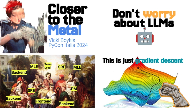
Vicki Boykis: “Closer to the Metal” (PyCon Italy keynote)
| ✨ Aesthetic | minimalist / robotic / pixel / classical art / renaissance |
| 🎨 Colors | blue, orange, turqoise, green-yellow, black, white |
| ✍️ Fonts | Jersey 25 (titles), Jersey 15 (titles), Roboto (body) |
| 🛠️ Tools | Google Slides, Photoshop |
“My general aesthetic is to keep the slide design process as minimal as possible because I’m not much of a designer and I don’t want people to know :D.
But my overall approaches in any content I produce are to use real human art. I’m not sure when I started doing this, but adding some art to technology content always feels balanced to me: we are not just sitting here writing classes and configuration files and worrying about scaling strategies. Even as technologists we are part of the tradition of makers and creators in humanity and I always want to tie my content back to that. Also I just really like looking at paintings and artwork. I knew that I’d especially be using Renaissance and other related artwork for a talk given in Florence.
At the same time, this was also a talk about LLMs, very deep technical dives into codebases, machine learning, and statistics. Hence the combination of the robotic-style fonts with the artwork and code and math displayed in monospaced/scientific fonts for clarity.
Finally, I want people to come to my talks to feel entertained. We are here doing serious things, but if we take ourselves too seriously, it takes all the joy and fun out of tech. We’re here to build stuff, break stuff, learn together, and laugh afterwards. That’s why a lot of my slides feel like meme templates, and also why I picked the title slide art as an image from a US public service poster from World War 2 and played with the effects using Photoshop Actions.”
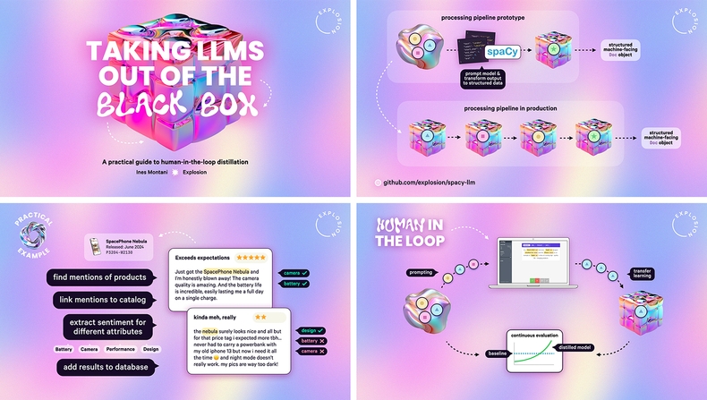
Ines Montani: “Taking LLMs out of the black box: A practical guide to human-in-the-loop distillation”
| ✨ Aesthetic | iridescent / bubbly / chrome / gradient / Y2K |
| 🎨 Colors | lavender purple, light blue, pastel pink, light yellow-orange, purple off-black, white |
| ✍️ Fonts | Wubble (title accents), Poppins Extra Bold (titles), Calibre (body), JetBrains Mono (code) |
| 🛠️ Tools | Keynote, Photoshop |
“I’ve always wanted to create a modern take on a Y2K-inspired aesthetic and was looking for an opportunity to use that bubbly font, which is too much for full texts, but works nicely as an accent. It all came together when I found a set of iridescent chrome shapes, including cubes, blobs, rings and spheres, which felt like a good way to illustrate different types of NLP models. The concept of distilling large general-purpose models into smaller components is fairly abstract and I figured it’d help to introduce different shapes that I could keep referencing throughout the talk.
The subtly grainy background gradient uses similar colors and adds some life to slides that are otherwise very empty, with an opaque white background or shadows to keep text readable. To separate external references, like my work in the intro and the example case studies, I used a design with a dark background instead. I had a lot of fun making the slides and seeing those bubbly shapes made me happy every time, which was great for staying motivated, and finish writing and putting together the content.”
Picking an aesthetic
I guess you could call my approach to making slides very aesthetics-driven. It’s not for everyone, but it works well for the types of talks I do, and it helps bring some life into technical topics and higher-level strategic concepts that are otherwise pretty dry and abstract. I like the element of surprise it adds, and maybe it can even make someone’s conference day a little bit less draining and exhausting. There’s something about us as humans that makes us enjoy themed experiences – it’s probably the same reason we like theme parks or other types of “immersive” escapism.
Your visual aesthetic is a great opportunity to sprinkle in a little bit of your personality, which you don’t always get to do in tech. If you’re going all-in on an idea, I’d recommend making sure it’s something that the audience will likely get or that still conveys a more general, recognizable theme. For example, you can reference your favorite obscure video game if it’s still recognizable as a video game aesthetic or hell, even Taylor Swift album art if it still reads as minimalist Helvetica or grunge newspaper clippings. There’s obviously somewhat of a bias towards nerdy retro vibes at tech conferences, which you can totally lean into if you like.
Another source of inspiration is the topic or venue of your talk. Deep tech topics like AI can be tricky to illustrate if you take them too literally (and you probably want to avoid all that generic ”glowing brain” imagery – Jodie solved this well by going for a more Blade-Runner-esque retro futuristic theme). You can also take it one step further. Maybe your talk uses practical examples from an industry associated with a certain visual style – like newspaper or magazine design for media, or X-ray effects for the medical field. In Vicki’s keynote, she used the historic House of Medici of Florence (where the conference was held) as inspiration for a fictional “Medici Corp” who are exploring the use of AI and LLMs. This established a great storyline for the talk and naturally suggested the use of historic paintings, reminiscent of the great “Men to Avoid in Art and Life” book. The bold pixel font provides a nice contrast and brings it back around to technology.
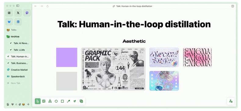
Early version of a moodboard collecting inspiration for my talk
I recently wrote about my favorite tools and how I use the Arc browser and its “Easels” feature to plan out my talks. It comes with a very smooth and intuitive interface for moodboards and lets you “capture” any content from the web while browsing. Of course, you can also do something similar in any other note-taking app – but I recommend collecting all inspiration and references visually and in a single place, as it makes it so much easier to write your talk once you’re ready. If looking at your moodboard gets you excited, you’re in the perfect mindset to smash out those slides and tick that talk off your todo list.
Statement slides
Adding “statement slides” throughout your talk is a great way to summarize the most important takeaways and break down your content. They’re especially useful in talks that function as opinion pieces or present strategic advice or lessons learned from solving a particular problem. Sometimes I even start with them when writing a new talk and first establish a through line with statement slides, then fill in the sections.
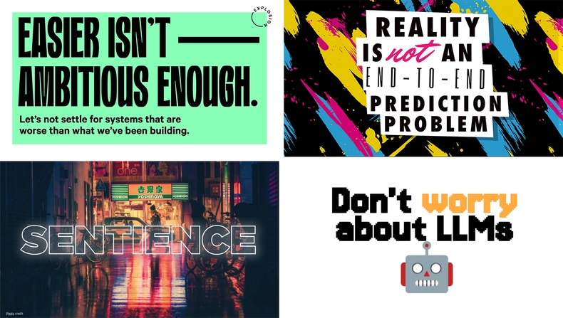
Examples of statement slides from my talks (#1, #2), Jodie (#3) and Vicki (#4)
Your statement slides can contain as little as a word or single, punchy sentence in a large font, or short bullet points or speech bubbles for compact summaries. This also means they’re more likely to turn out okay in pictures if listeners want to snap a quick photo as a reminder, even if the conference uses a lower-resolution projector or unideal lighting. (Pro tip: If you’re new to speaking, a well-presented statement slide also increases the likelihood of someone sharing photos from your talk on social media!)
Closing slide
This one is pretty standard and should be the last slide of your presentation. Here, you can thank your audience and include further links and your social profiles. I typically choose a design similar to the title slide, which makes for a nice visual closure.

For my LinkedIn, I like to include a QR code so people can connect instantly. You can download yours by clicking the button in the search bar on the mobile app and saving the image. Alternatively, you can also use a QR code pointing to additional resources, like a GitHub repo, although I’d recommend keeping it to one or two codes max so your slide doesn’t feel overwhelming. Also make sure that the code isn’t too small, so it can still be scanned from the back of the room.
This generator makes it easy to create your own QR code and even customize its style to fit your slide design. You can also experiment with this generator, which uses a stable diffusion model (thanks to Laura for the tip, you can see it in action in her also well-designed talk here).
If your talk is followed by a Q&A session, conferences will often leave your final slide on, which gives people in the audience time to check out your links, scan QR codes and connect with you on social media.
If you want to go for an aesthetics-based approach, there are very few limits. If you’re worried about your slides becoming too gimmicky, start small and subtle – like with a themed font or illustration style for content you were planning to include anyway (see my previous post for tips). Make it a habit to collect inspiration and any visuals you like, even outside of your work and conference talks – often, the best inspiration comes from everyday life and when you least expect it.