Making beautiful slides for your talks, part 4: Design elements and inspiration
As a teenager, I was really into creating and designing websites. It was my biggest hobby (before being online 24/7 was common or “cool”), and there were many days where I couldn’t wait to get home from school and continue working on a new design. To this day, this is the feeling I’m trying to recapture when making slides. If opening up the presentation to work on it is getting me all excited, I know I’m on the right track.
In this series, I’ve already covered general design tips and how to find an aesthetic, so this post dives deeper into the little details. I’ll include examples of visual design elements I used to implement different aesthetics and share some resources and inspiration you can use for your talks.
🎨 Part 1: Design tips for beginners ✨ Part 2: All about aesthetics 🛠️ Part 3: Technical content 🧩 Part 4: Design elements 💌 Part 5: Sharing your presentations
Disclaimer (since my previous post also got widely shared outside of my circles): This blog post series is not intended as a general-purpose guide to making universally good slides. It mostly collects some tips based on how I make my slides, which are quite specific and targeted to a certain type of conference, talk style and audience. I get a lot of questions from people who like my slides and want to do something similar for their talks, which is what inspired this post.
Design elements
Not everything you use has to have a deeper meaning – most of the time, I use design elements because I think they look kinda cool. I think that’s fine, as long as you don’t overdo it. Attention to detail also helps keeping your audience engaged and I like the element of surprise and including little details to discover on each new slide.
Boxes and containers
Boxes and containers are the simplest and most obvious design elements: they group content together and ensure that text remains readable, e.g. by giving it a solid white background color. I like to play around with different styles like borders, background opacity, shadows and rounded corners to match the style of my presentation.

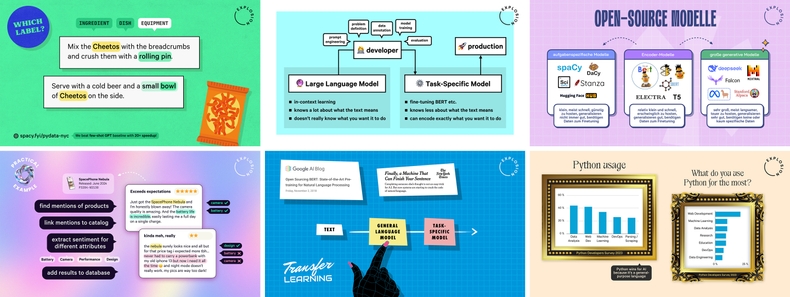
Examples of boxes and containers used in my slides (#1, #2, #3, #4, #5, #6)
Speech bubbles, arrows and annotations
Many of my talks include diagrams and flowcharts to explain technical concepts. These usually combine boxes, arrows and speech bubbles for annotations, and are great to visualize dynamic processes – much better than just plain text.

Comparison of the same content as a list and visualized as a flowchart
For arrows, you can experiment with solid, dashed or dotted lines, different arrowhead styles, colors and curves. Speech bubbles can optionally have rounded corners, borders, shadows or a slightly see-through background color, and point to the relevant element on the slide. I try to stick to a minimum font size of 30pt, to make sure that annotations are readable, even from the back of a room. I also like to use them as an alternative to a regular lists and collections of keywords.

Emoji and icons
The easiest way to incorporate emoji is by using those that come with your operating system, like Apple’s colored emoji set. However, there’s are many different styles, including open-source sets like OpenMoji or pixel art icons from SerenityOS. I typically try to pick an emoji or icon set that best fits the overall aesthetic of my slides.

You can use emoji in place of list bullets or as recurring icons to illustrate a concept or term. They also give you quick and easy illustrations in a consistent style. Whenever I need an illustration, I first check if there’s an emoji for it!

Examples of emoji as illustrations used in my slides (#1, #2, #3)
Gradients, patterns and textures
If solid background colors feel too plain and your slides need more “life” or “pop”, what you’re looking for are textures or patterns. This is also one of the best ways to connect your design back to your talk’s aesthetic.

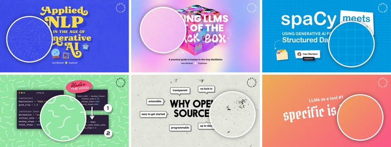
Examples of textures, gradients and patterns used in my slides (#1, #2, #3, #4, #5, #6)
There’s a huge variety of textures available on sites like Freepik, Pixelbuddha or Creative Market, from surfaces of real-world objects like paper, plastic or paint, to noise and distortion (think old VHS tapes). You can also search those sites for so-called “seamless” patterns, meaning patterns that can be tiled and repeated. For gradients, you can find inspiration on uiGradients, Gradient Hunt or Coolors, which is also a great resource for color palettes. Just try to avoid backgrounds that are too visually busy to not distract from the content, and use boxes (see above) with a plain background color if needed to keep texts readable.
Shadow and glow
Elevation, light and shadows imitate paper and create depth, and you can use them to add a more designed feel, make text more readable or introduce visual hierarchies. (Google’s Material Design has some nice examples of how shadows can be used as part of a design system. If you want to go even deeper, this tutorial covers shadows in CSS, but you can also apply the tips to other tools and mediums.)

You can experiment with different combinations of the distance and offset (how far away the shadow is placed), blur (how soft or blurry it is), opacity (how transparent it is), color (whether to use the standard black or a custom color) and also the angle (where the light source is coming from).
Some fonts include variants for adding depth, which you can layer on top of each other to create a 3D effect – for example, the 70s-style Alkaria, which I’ve used in my talk on applied NLP, or the retro sign-inspired Frontage. In fact, MyFonts has a whole collections of stackable fonts to choose from.

Font stacking with shadows and 3D effect (Alkaria, Frontage)
More tips and tricks
Learn your presentation tool’s styling shortcuts
Keynote and PowerPoint both have a “copy style” feature that lets you apply the same formatting and style of one shape or element to another. This typically includes the background color, borders, shadows and font settings. You can also save element styles as a preset that you can apply with one click. I also use grouping for elements and layers, so I can move them around together as I design my slides, and I usually lock fixed objects like the logo and background elements so they stay in place.

Part of my customized toolbar in Keynote with added shortcuts for grouping, styling, layer order and locked layers
Also keep an eye on actions you commonly perform in the design process, including those that feel really tedious, and check if there are keyboard shortcuts or buttons that you can add to your toolbar for easy access. (For example, Keynote’s support for alternate glyphs, i.e. different versions of the same letter in fonts that support it, isn’t super convenient, but I was pleased to discover I could at least toggle the typography panel with ⌘+T.)
Use an asset manager
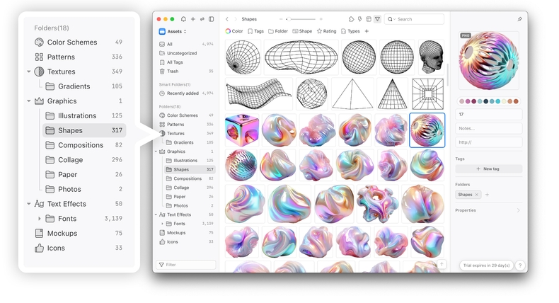
Once you start collecting design assets like illustrations, patterns or textures, you need a way to store and organize them. I use Eagle, which is available for a one-time license fee and comes with a great UI for categorizing, tagging, searching and viewing design files. It supports all common file formats, including Photoshop and Illustrator files, automatically creates preview images and lets you drag and drop assets into your design or presentation tool. There’s also a browser extension that makes it easy to save screenshots and images from the web. I currently have two libraries: one for inspiration and screenshots, and one for design assets.

My design asset library and custom folders in Eagle (I clearly had a lot of fun organizing my files!)
In part 1, I already recommended using a font manager like RightFont or FontBase once you get serious about collecting fonts, and an asset manager is a great complement to that. If you’re working in an organization with a dedicated design team, you can also check in with them to see which tools they already use and if you can get in on it.
Resources
| 🖼️ Textures | Freepik, Creative Market, Pixelbuddha |
| 🎨 Gradients | uiGradients, Gradient Hunt, Coolors |
| 🧩 Patterns | Freepik, Creative Market, Pixelbuddha |
| 😀 Emoji | Emojipedia, The Noun Project |
| ✍️ Stackable Fonts | MyFonts, Creative Market |
| 🗃️ File Managers | Eagle, RightFont, FontBase |
| 👩🎨 Design | Photoshop, Illustrator, Figma, Sketch, Canva |
| 💻 Presentation | Keynote, PowerPoint, Google Slides |