Three transformative tools: a review of my favourite apps
There’s this feeling of joy and excitement you sometimes get when you start using a new tool, discover the little details that make a product great and feel the rush of motivation and new ideas that comes with it. It’s what I’ve always aspired to do with our products, too, and it’s what motivated this blog post. I use many tools in my day-to-day life and work, but these three have had the biggest impact recently.
Arc: Reinventing the browser
It’s a bold move to just go and reinvent something as fundamental as the web browser. But that’s exactly what NYC’s The Browser Company are doing with Arc, and the result is pretty stunning and a breath of fresh air in the otherwise quite boring and cookie-cutter browser landscape.
I’ve switched browsers a couple of times in my life: Internet Explorer because there weren’t many options, then Firefox when it was new and cool, over to Chrome, which felt much fresher and snappier at the time, then back to Firefox Developer Edition for better speed and privacy. And now I’m using Arc, which is based on Chromium under the hood.
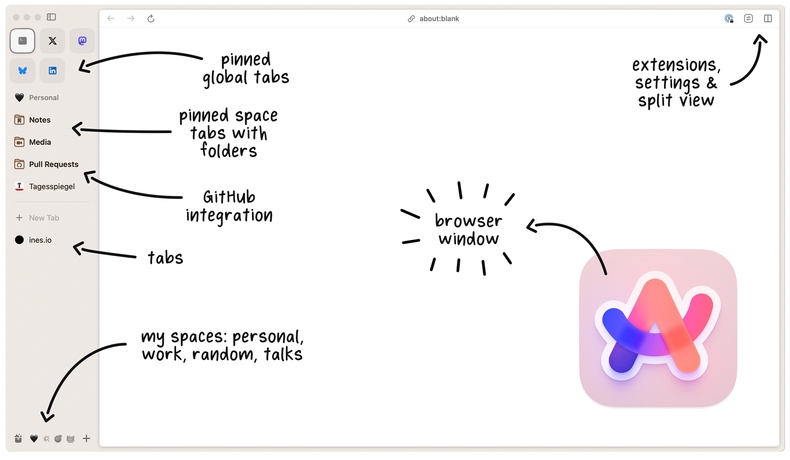
The concept of tab containers and separate spaces or profiles isn’t new, but Arc implements it very well, with nice visual customisations to tell your spaces apart, keyboard shortcuts to switch between them and per-space bookmarks pinned to the sidebar.
Which leads me to the elephant in the room and the main difference you’ll notice immediately, compared to conventional browser designs: the sidebar. It’s definitely the one feature that took me the longest to get used to, but it makes a lot of sense conceptually as a more natural way to organise tabs and bookmarks. It can be toggled using keyboard shortcuts, giving you a clean, fullscreen experience of the web. Clicking links with shift lets you peek before opening a new tab (nice little detail: the visual indicator of open peeks in the sidebar!), and split mode lets you view multiple tabs side-by-side.
”Little Arc” is a simple browser window for opening links from other applications, which you can optionally move to the main browser. It’s a smart solution to the otherwise almost inevitable “tab hell” where important work pages mix freely with that one meme someone sent you two weeks ago.
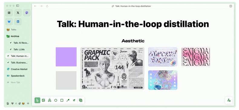
My Easels collecting inspiration for my talks
Do we need even more note-taking tools? Arguably not, but when it’s about capturing content from the web, we might as well do it in the browser. ”Easels” are essentially whiteboards that you can write and draw on, and use to collect links and images. It’s only tangentially related to web browsing, but Arc just casually gives you one of the smoothest user interfaces for organising content: it just works, aligns and looks good out-of-the-box. This feature is what first got me interested in Arc and I started using it for planning my talks and slides and for collecting moodboard-style visual inspiration and resources.
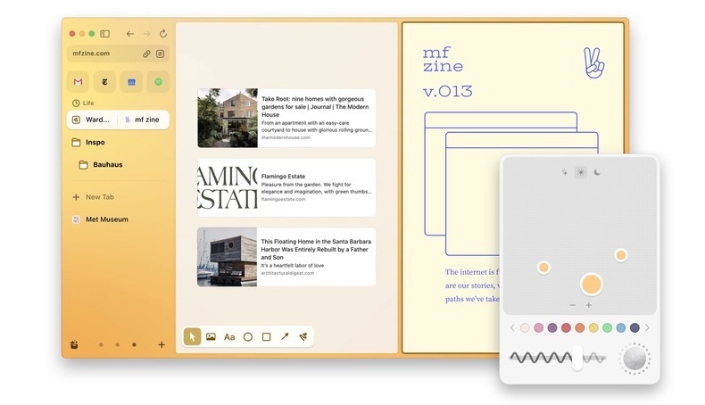
If you know me, you know I’m a sucker for excessive UI and design customisations (which is also why tools I build tend to have a lot of it). It just makes me happy to adjust the look and feel of my apps. Does a browser sidebar need multi-colour gradient backgrounds with adjustable levels of grain effect? Probably not, but Arc just has it and it looks great.
There are many browser extensions (e.g. Greasemonkey) for changing the look of websites, either for fun or to fix accessibility issues and improve readability, or to get rid of annoying content, non-blockable ads and other elements that websites added because it’s good for “engagement” or whatever. Arc’s version of this is called ”Boosts” and ships out-of-the-box with an intuitive visual interface. You can adjust colours, contrast, fonts and zoom levels on a per-website basis, “zap” elements to hide them, and even add fully custom CSS and JavaScript. Now that it’s so easy, I definitely want to use it more.
In general, there are many features that Arc confidently takes out of the extension space and into the core application. It increases the scope of what a browser can and wants to do, but it makes for a consistent user experience with the same attention to detail across all parts of the app. The opt-in AI features, called ”Max”, are tasteful and include some nice and practical ideas, including summarisation, in-page question answering and automated tab tidying, plus a shortcut for ChatGPT in your command bar. The quote sharing feature feels very useful, too: if you highlight text on a website, you can auto-generate a sharable link that points right to the highlight. I also love Arc’s visual identity, and the playfully designed release notes that double up as a kind of newsletter are a joy to read. I don’t think I’ve ever looked forward to updating my browser this much.
A development philosophy we’ve set for ourselves a couple of years ago is “You can reinvent the wheel, but don’t reinvent the road.” What this means is: it’s okay reimagine something that already exists to make it better, but don’t lock users into your new end-to-end way of doing things. (One could argue that this is what Google is doing by controlling Chrome, search and navigation, and not-so-subtly forcing the web to adopt AMP.) Arc sticks to reinventing the wheel and it’s refreshing.
Missive: Collaborative email
There are many tools that promise to help you get in control of your email, which can become overwhelming, especially once you add user and customer support to the mix. We did a bunch of research to find the best-suited collaborative email tool for Explosion and eventually ended up with Missive, which integrates with Gmail and provides a web, desktop and mobile app. There’s something about tools built by small independent teams that we naturally seem to gravitate towards: you can just tell that somebody cared, and it’s reflected across the product and its user experience. Missive really was a game changer for me and I honestly couldn’t imagine my day-to-day work without it.
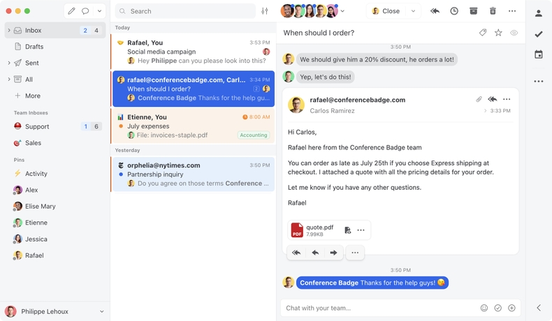
At the core of Missive is a collaborative-first design: email threads can be shared with individual people or teams, assigned to others and discussed inline. Team members are then able to collaborate on drafts, create todo-style tasks within a thread and upload files. The chat history is preserved so you can always see the internal discussion that led up to a reply. This cuts out a huge amount of fragmented communication that would otherwise happen on Slack or elsewhere, and removes the need for email forwarding or disjointed inboxes.
Need someone to find you a file to attach to an email? Assign them a task on the email thread and they can upload it right there. Want feedback on a draft reply? Share it with the team. A new purchase order comes in? Assign it to the operations team and move it out of your inbox. Got multiple emails related to the same conversation? Link or merge them into a single thread.
Having good automation is probably the single most important trick for staying productive and efficient as a small team and we try to take advantage of it wherever we can. Different types of emails are automatically routed to different inboxes and shared with different people, specific labels can auto-snooze threads for a given period of time and canned responses with variables make it easy to handle common questions and requests.
When looking at tools to adopt, a developer API is always a big plus because we know that we can add our own automations if needed. For Missive, we built integrations to automatically stream in GitHub issues, discussion posts and Prodigy forum threads and also connected it to Typeform, e.g. for our consulting application form, making Missive the central hub for all communication.
DayOne: More than just a diary
It might be the nerd in me, but I’m low-key obsessed with tracking various things I do. I take a lot of random photos, document how I feel, where I went, what I read, watched or listened to, and my Oura ring logs my sleep phases, heart rate and body temperature day and night. Will I ever care about what podcast I listened to or what I had for dinner last Tuesday? Maybe? Maybe not? Aside from leaving an enormous digital footprint and possibly helping me establish an alibi should I ever need one, there’s little purpose to it. But hey, people say that journalling helps with general wellbeing and mindfulness, which is about as far as I’m willing to go in terms of self-help.
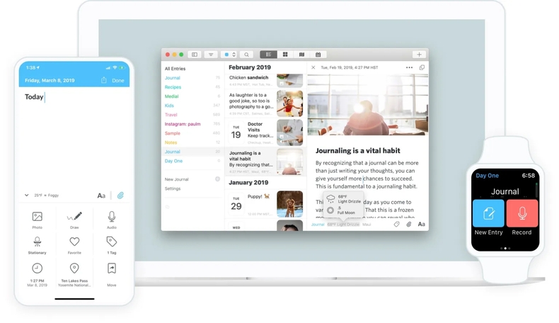
I’ve cycled through so many todo list and note taking apps in my life and occasionally dabbled in diary writing, but nothing ever stuck until I tried out DayOne. It’s marketed as a journalling and diary app for web, desktop and mobile, but I mainly use it as a daily planner, todo list and multi-media life log. My “daily check-in” template includes sections for short-term and long-term tasks, a log for what I listened to, watched or read, bullet-point thoughts and photos (I try to add at least one a day, even if it’s just a cat picture).
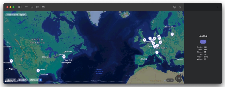
Map view of my journal
Although the tagging system is fairly basic, I’ve come up with my own hierarchy for everything from mood to various activities. DayOne also includes location data and I get a nice overview of places I’ve been. A second “meta” journal I’ve created gives me a place to store other lists that accumulated over the years, like the hundreds of concerts I’ve been to since 2004, which I started as a teenager and meticulously updated on my Livejournal profile back in the day.
I’m currently on a 750-day streak of daily updates and preparing my check-in has become a nice and consistent morning routine while I’m getting ready for the day and loading up on caffeine. Perhaps future me will thank me for it one day.
