Making beautiful slides for your talks, part 6: Community showcase
Every once in a while, people reach out to me to share their slides inspired by my blog posts and it always makes me happy to see that my tips have been useful. Sometimes I even get to experience the talks in person! For this blog post, I want to showcase more examples from the community for inspiration, with details on the design, aesthetic, colors, fonts, tools and process, as well as some actionable takeaways. Also see part 2 and part 3 for more example slide decks. Thanks to everyone for participating!
- 🎨 Part 1: Design tips for beginners
- ✨ Part 2: All about aesthetics
- 🛠️ Part 3: Technical content
- 🧩 Part 4: Design elements
- 💌 Part 5: Sharing your presentations
- 💜 Part 6: Community showcase
- 📚 Part 7: Resources and tools list
Disclaimer (since my previous post also got widely shared outside of my circles): This blog post series is not intended as a general-purpose guide to making universally good slides. It mostly collects some tips based on how I make my slides, which are quite specific and targeted to a certain type of conference, talk style and audience. I get a lot of questions from people who like my slides and want to do something similar for their talks, which is what inspired this post.
Showcase Overview
This post features some of my favorite slide decks from others in the community, as well as some of my own.
- 💜 Matthew Upson: “Debugging Leadership: Six Errors when Moving From Code to Management”
- 💜 Tereza Iofciu: “AI, the double edged sword in dealing with disinformation”
- 💜 Alexander C.S. Hendorf: “Structured Automation With Agentic AI”
- 💜 Ines Montani: “Conquering PDFs: document understanding beyond plain text”
- 💜 Ines Montani: “Building AI with AI”
Matthew Upson: “Debugging Leadership: Six Errors when Moving From Code to Management”
| ✨ Aesthetic | retro-futuristic / console-core |
| 🎨 Colors | black, white, orange, turquoise green, red |
| ✍️ Fonts | Monofuture (titles), Roboto (body) |
| 🛠️ Tools | Google Slides, Inkscape, Imgflip (memes) |
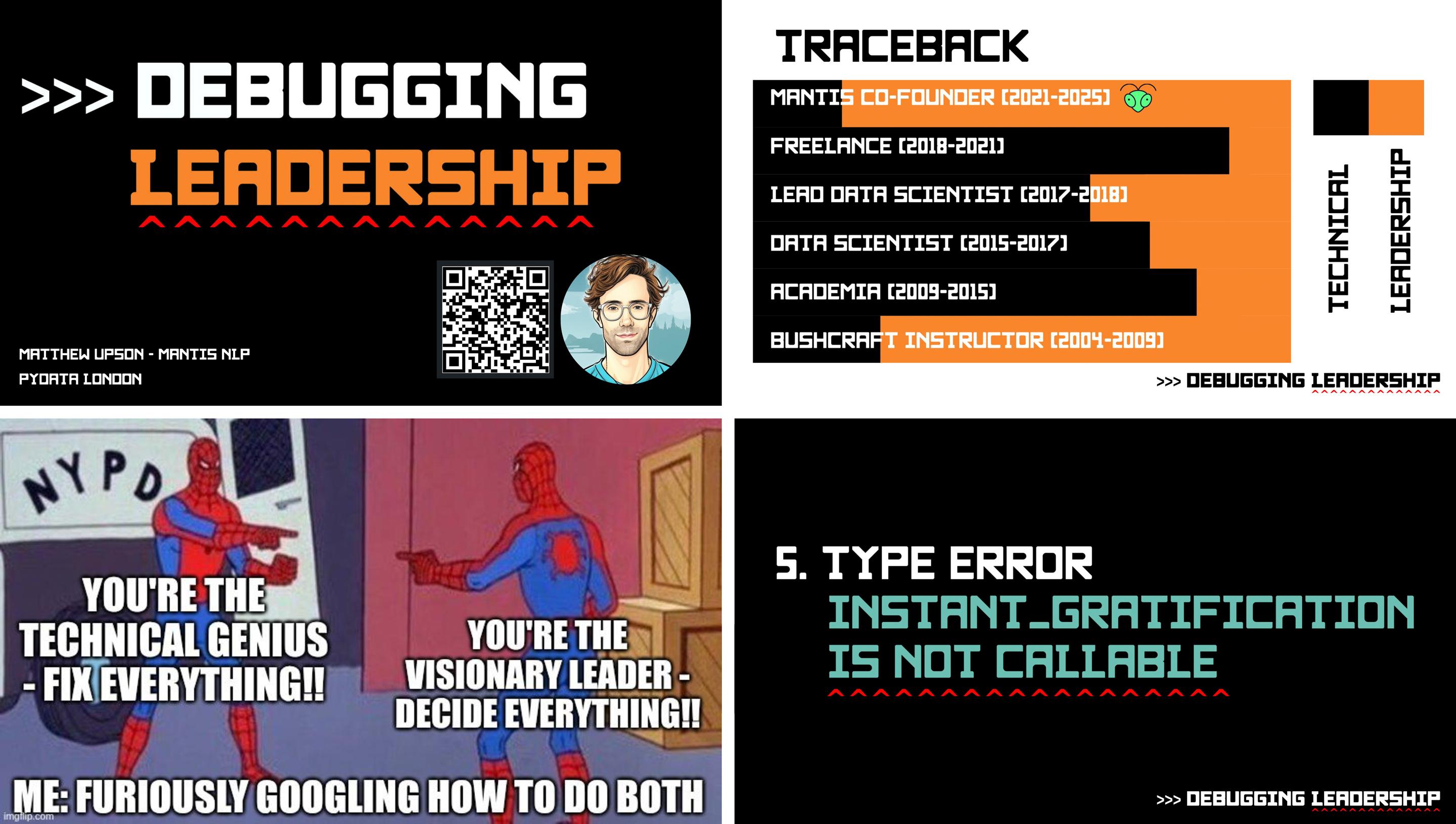
Slides“I really leaned heavily on Ines’ guide for building slides, and started with finding a font that fitted the talk. This was a talk about leadership, but I really wanted Pythonistas in the room to not be alienated by the subject matter - so I came up with the idea of framing it as Python errors.
I wanted the aesthetic of the slides to fit with the errors theme, so I looked for a font that would make it look like a console but was more bulky and had more character than a typical console font. I loved Monofuture. It has a great sci-fi feel. I used a Python prompt (>>>) and carets (circumflex accents that mypy uses to indicate type errors) to add more of a console feel.
As Ines suggested, when you choose a font you can see how the designer intended it to be used, the color palette, and design, etc. I did exactly this, and replicated the colors the designer used on Creative Market, using those throughout. I tried to keep the slides really simple, aiming for ~3 lines maximum, so that it acts more as a prompt rather than containing the whole content of the talk.
A good takeaway for me was not to use slides with a black background. They look great on a screen, but projectors can struggle to produce the same depth of black, and it made some of the slides less easy to read than I would have liked during the presentation.”
✅ Takeaways for your slides
- Many font stores include not only plain examples of the font itself, but also sample designs of the font in use. Those are typically provided by the font creator and intended to make the font shine in a matching aesthetic – so perfect to take inspiration from! If you like a font but are unsure about how to best employ it in your slides, start by replicating one of its sample designs and go from there.
- Take advantage of associations, analogies or metaphors from your talk’s title and content. For example, the expression “debugging leadership” connects back to coding and thus makes for a great talk title – but it also lends itself to visual design ideas, like squiggly underlines that people commonly associate with errors.
- Be careful when using slides with a black background – projectors may struggle to produce the same depth of black, making your slides harder to read.
- Google Slides doesn’t easily support custom fonts, so Matthew used Inkscape to create images for the headlines as a workaround.
Tereza Iofciu: “AI, the double edged sword in dealing with disinformation”
| ✨ Aesthetic | newspaper / collage / Feminist AI |
| 🎨 Colors | beige, salmon pink, hot pink, lavender purple, grey, black, red, mauve, brown, light yellow |
| ✍️ Fonts | Druk (titles), Proxima Nova (body) |
| 🛠️ Tools | Keynote, Affinity Designer, Perplexity |
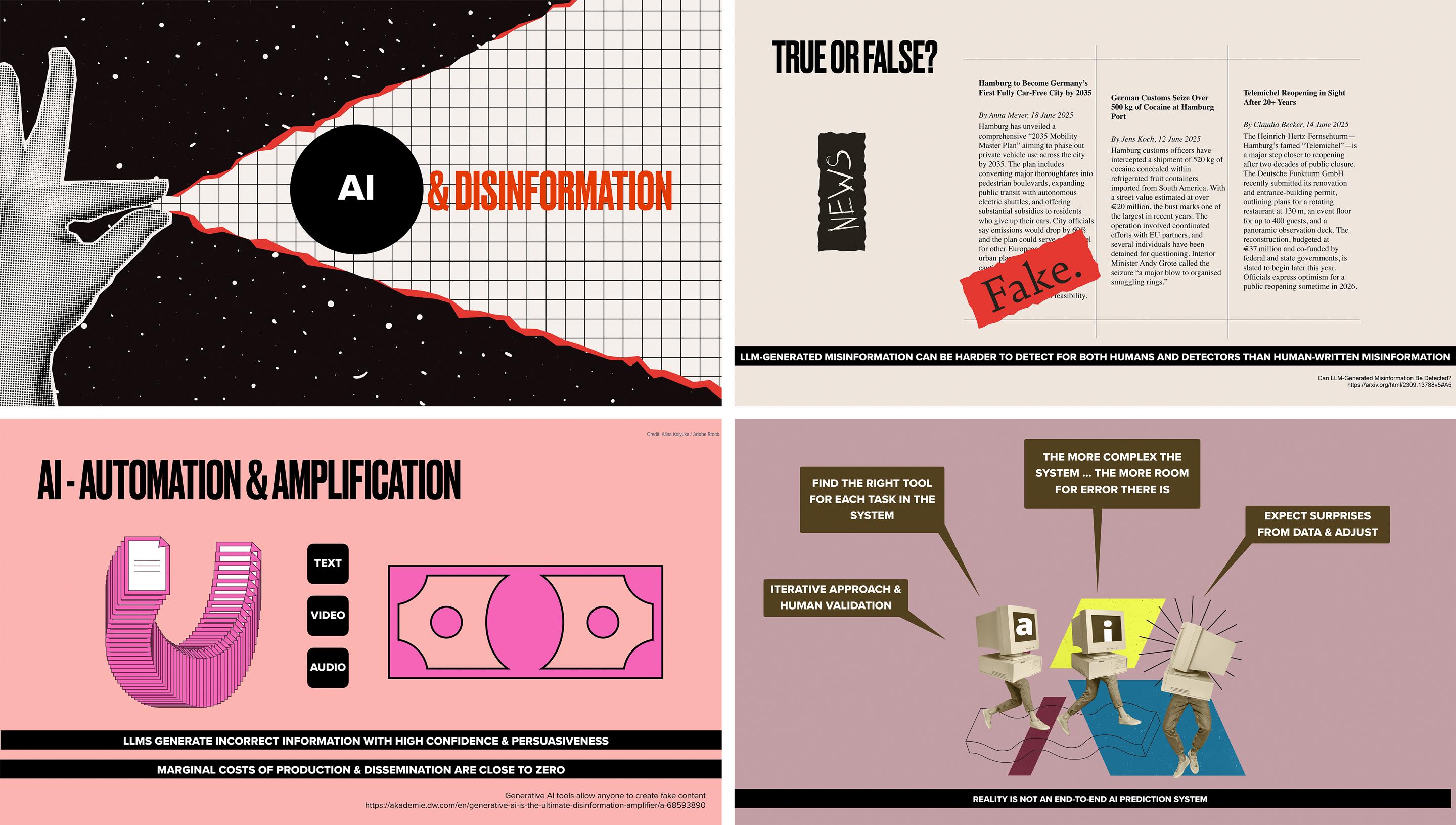
Slides”The style of my slides was greatly inspired by the zine table at the Feminist AI Lan Party during PyCon DE & PyData – so mixing fonts with ‘random’ newspapers like cut images to form stories and collages. This was also kept fresh in my mind by Garbriela Moraes’ posts on LinkedIn which also are sometimes collages. Somehow I felt the feminist collage style fits to the topic of disinformation where the tools of noise and overwhelming are used.
My process usually starts from selecting the main colors, this time I went for the ones on my website. I wish I could say I have a structured process but it rarely is. The word I would use is ‘serendipity’. Expose myself to lots of inspiration sources. For example, I now looked at some of Ines’ past talks, which opened my mind to more possibilities than the usual keynote template. I was using Perplexity to structure the thought I had for my talk… kinda like rubber ducking, as I had both a new topic and no clear idea of the goal.
During the content research I found an article which had the one image from Alina Koluka, which I liked. I saw the reference and then went to Adobe Stock and looked at all their graphics. I created an account and downloaded several. It is cool that they were already vectors, so I could also use parts of the graphics. On the slides using these I updated my style to fit the images. In the middle of the talk, where I got to the part where the AI is eating itself, I wanted a nice illustration for the snake. So I stumbled upon the art of Dan Bejar. Luckily they had several images for articles on disinformation and cybersecurity I could choose from. Sometimes the graphics might change my storyline, which is also something I stay open to. I do try to limit the number of main colors.”
✅ Takeaways for your slides
- Generative AI models can be useful tools to help you structure the design process and “rubberduck” your ideas. Think beyond just using them to generate results and instead let them help you iterate on your ideas. (The same is true for AI development, by the way!)
- Stock image sites like Adobe Stock or Shutterstock offer more than just photos and are another great source for finding design assets and graphics in different styles (and supporting their creators). If you work for a larger organization, ask your design team whether they already have an account or subscription they can share with you.
- Expose yourself to lots of inspiration – both online and offline! Follow artists you like on Instagram or snap photos while you’re out and about. You can use an asset manager like Eagle (see part 4 for details) or a private Pinterest board to collect inspiration.
Alexander C.S. Hendorf: “Structured Automation With Agentic AI”
| ✨ Aesthetic | brutalist / zine / cut-and-paste collage / ZTT |
| 🎨 Colors | black, white, signal yellow, hot red, multi-color |
| ✍️ Fonts | OCR B, Times New Roman, Eurostile, Calibri, Cavolini and more bold condensed sans-serif / typewriter / futuristic |
| 🛠️ Tools | PowerPoint, Generative AI (image editing) |
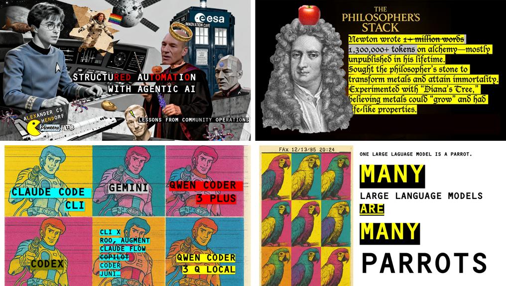
Slides“We live in chaotic times — my job as a speaker is to deliver clarity. So contrast is the whole design system. Slides aren’t the centre of a talk, they’re support — a second voice that carries insight without words: a color, a cut-out, a hidden image, a single colored letter. Letters in a title aren’t one color by accident; they’re highlighted the way a manifesto poster is, because in noisy times something has to jump out. Order without contrast is invisible. Look closer and you’ll find Easter eggs, jokes, references that reward attention.
I also lean into obscure and funny elements deliberately. The audience has spent the morning being told to be afraid of AI by someone in a navy suit. The moment they laugh, they open up — and then they hear the argument. Humor is the access pass. Pop-culture characters cut out and pasted onto a backdrop work as a shortcut: Spock, Picard and Vader on the same slide tell you instantly that agentic AI is a cast of characters with conflicting rules, before I say a word.
The visual DNA goes back to my teen years — The Art of Noise and the ZTT Records sleeves of the mid-80s. ZTT ran covers like manifestos: gleefully nonsensical back-cover text, faces hidden, classical statuary next to machine-gun typography, titles split into sharp red caps and small white italic so two voices share one cover — urgency and play. The sleeve was the argument. That’s exactly what I want my title slides to do: read like a magazine cover, argue before I open my mouth, and reward the audience that looks twice.
So the rules: one accent color per slide (everything else black/white or duotone); one concrete cultural anchor per deck (a Pacman, a Western prospector, a Renaissance portrait, a TARDIS — never generic ‘AI imagery’); Easter eggs in the collages for the people who lean in; a title slide that has to work without my name on it. Visibly pasted together, magazine-cover loud, brutalist plus collage. The opposite of consultant gloss.”
✅ Takeaways for your slides (from Alexander)
- Treat the slide as a second voice that delivers contrast, not duplication. A complex talk doesn’t need slides that repeat your sentence — they can carry a complementary signal without words: a color, a cut-out, a single highlighted letter. The audience gets the message twice (once visually, once verbally), so neither has to overload.
- One concrete cultural anchor per deck beats generic “tech imagery” every time. A Pacman, a TARDIS, a Western prospector, a Renaissance portrait – these argue your point before you open your mouth. The rule is concrete, not generic: “Newton as alchemist” beats “data and AI”. Pick one anchor and commit; mixing references turns a deck into a Pinterest board.
- Use colored letters as signposts. Highlighting a single word inside a black-and-white title, like the red caps + white italic on Art of Noise’s “Who’s Afraid of the Art of Noise?” sleeve, gives the eye a place to land first. It also survives bad projection, where subtle color shifts wash out but a strong single accent still reads from the back row.
- Reward people who look closer. Hide a small Easter egg, a running motif, or a sly reference across the deck. The audience members who lean in feel rewarded, the others aren’t penalized. This is the difference between a slide that works once and a slide people photograph and share.
- Humor is an access pass for serious topics. An absurd or unexpected image early in a talk on AI strategy lowers an executive audience’s defense shield. After they laugh, they’re listening. Caveat: pick references your specific audience will actually catch – niche-tribal works, niche-private doesn’t.
Ines Montani: “Conquering PDFs: document understanding beyond plain text”
| ✨ Aesthetic | 3D / bubbly / balloon / shiny pastel |
| 🎨 Colors | lavender purple, turquoise green, hot pink, blue, light yellow, light purple, light blue, off-white |
| ✍️ Fonts | Pink Sugar (titles), Calibre (body), JetBrains Mono (code) |
| 🛠️ Tools | Keynote, Photoshop, Carbon (code examples) |
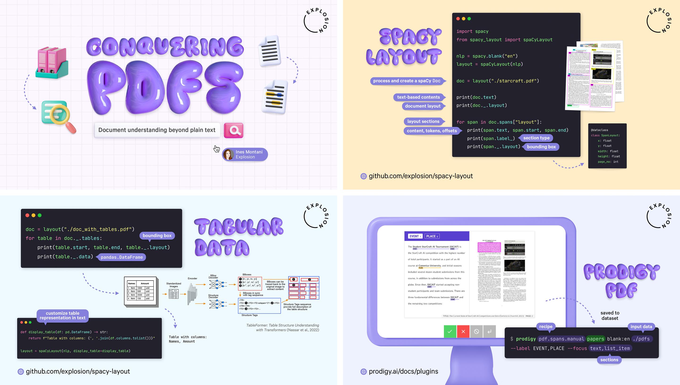
Slides Blog post“Like many of my designs, this one started with a font. The balloon-like letters go well with a modern and bright 3D aesthetic, which I used for icons and boxes, in a style similar to Microsoft’s Fluent 2. Lavender purple is one of my favorite colors (in fact, it’s the theme color of my bedroom!), and I customized the titles and illustrations with a hue and saturation adjustment layer in Photoshop. I also tried out curved shadows instead of my go-to drop shadows to better match the overall vibe. Since the title font and illustrations already have a lot of visual depth, the slides otherwise feature plain backgrounds, with different colors separating the different topical sections.
This talk is an especially technical one that shows the implementation and usage examples of processing PDF documents with spaCy and Docling. It features a lot of code, so to make it easier to follow, I used animations that display the code one block at a time, and speech bubbles to annotate it step-by-step. To explain CLI commands, I also highlighted and annotated the individual arguments. Luckily, PDF documents are pretty visual, so I included previews wherever possible and used a computer screen illustration to make the examples stand out.”
✅ Takeaways for your slides
- Start with a display font you like (see part 1 for details) and build your style and aesthetic around it by asking yourself which design elements like icons, backgrounds or effects would go well with it.
- Use a design program to quickly adjust colors of your graphics to match your overall theme, for instance with adjustment layers in Photoshop. Their usage is very easy to learn and can make a big difference.
- Make long code snippets and CLI commands easier to follow by displaying them one block at a time, and annotating them with short explanations, e.g. using arrows or speech bubbles. You can also overlay semi-transparent colored boxes to highlight specific parts or arguments. If the code creates something, include examples or visualizations of the outputs. (Also see part 3 on technical content!)
Ines Montani: “Building AI with AI”
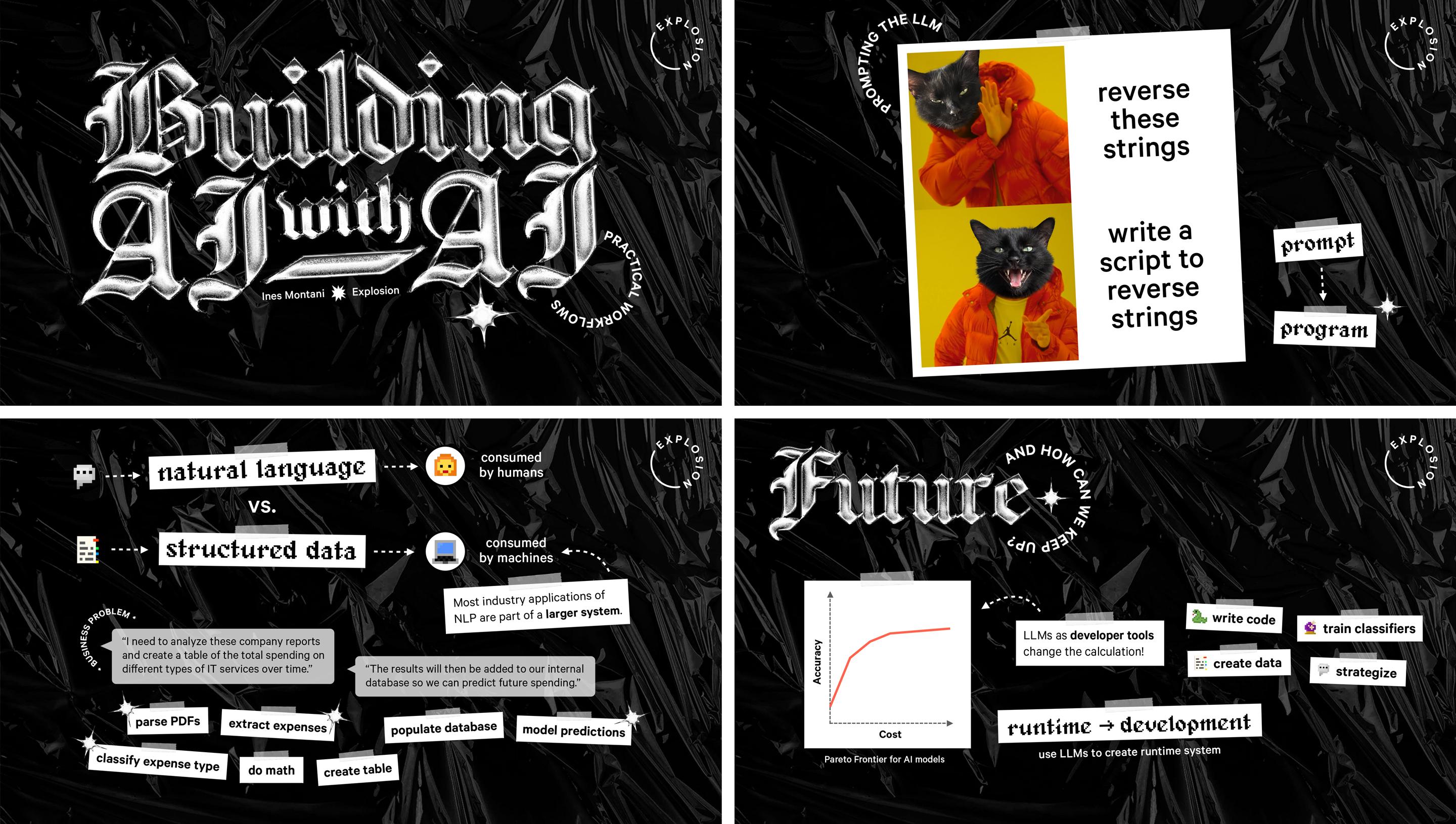
| ✨ Aesthetic | chrome / neo-goth / blackletter |
| 🎨 Colors | black, white, silver |
| ✍️ Fonts | Chomsky (titles), Alagard (accents), Delicatus (links), Calibre (body) |
| 🛠️ Tools | Keynote, Photoshop, Illustrator |
Slides”This design started with the silver chrome text effect I’ve been waiting to use for a while, and it turned into a mostly black and white slide deck, combining a bold blackletter display font (aptly named Chomsky) and pixellated accents and icons, with additional meta text laid out in a circle created with Illustrator’s type on a path feature. The low-contrast plastic texture aims to make the background a little less dull. For the sticky tape effect that matches the background, I used Keynote’s built-in picture frame borders. I also applied the chrome effect to a sparkly star icon, which appears across the slides as a design element and to highlight specific text boxes.
To illustrate some of the examples, I really wanted to use the popular Drake meme template, but without Drake and with a little personal spin instead, so I photoshopped it to use the face of my (very expressive) cat Stanislav Petrov.”
✅ Takeaways for your slides
- Get inspired by text effects, which you can find on sites like Creative Market or Pixelbuddha. They’re typically provided as Photoshop files with smart objects, layers you can edit that will automatically have the effect applied to them (see part 1 for details). This makes it really easy to apply cool effects without having to design them yourself. They often also include examples of fonts that pair well with the style. I typically create the styled titles in Photoshop on a transparent background, and then import them in Keynote as PNG files.
- I think memes can absolutely have their place in technical talks and offer a somewhat humorous way to make your point. (Matthew also made great use of them in his talk above!) If the template is recognizable enough, you can also adjust it to better fit your presentation’s style and colors.
- Look into the built-in styles and effects that come with your presentation tool. Most of them aren’t that exciting, but Keynote for instance has some pretty cool frame and border styles and list bullets that you can apply in one click.
Thanks for following along with this series and all the great feedback 🖤 Let me know if there are any other topics you’d like me to cover and I’ll keep adding to this series in the future. And of course, if you’ve created your own slides using some of my posts for inspiration, feel free to email me – I’d love to check them out!
