Making beautiful slides for your talks, part 3: Technical content
Software engineering, and Artificial Intelligence in particular, may sound exciting, but in reality, the problems you solve in your day-to-day work are often quite dry. In a talk, you may need to explain algorithms and mathematical equations, present results tables or walk through an implementation in code. And the great solution you’re showcasing isn’t always very visual – it’s often a program that prints a number and exits or outputs some really good vectors. In this post, I’ll share some tips and inspiration for presenting technical content in your slides and making “boring” topics more fun and engaging. I’ve also included some examples from the community again.
- 🎨 Part 1: Design tips for beginners
- ✨ Part 2: All about aesthetics
- 🛠️ Part 3: Technical content
- 🧩 Part 4: Design elements
- 💌 Part 5: Sharing your presentations
- 💜 Part 6: Community showcase
- 📚 Part 7: Resources and tools list
Disclaimer (since my previous post also got widely shared outside of my circles): This blog post series is not intended as a general-purpose guide to making universally good slides. It mostly collects some tips based on how I make my slides, which are quite specific and targeted to a certain type of conference, talk style and audience. I get a lot of questions from people who like my slides and want to do something similar for their talks, which is what inspired this post.
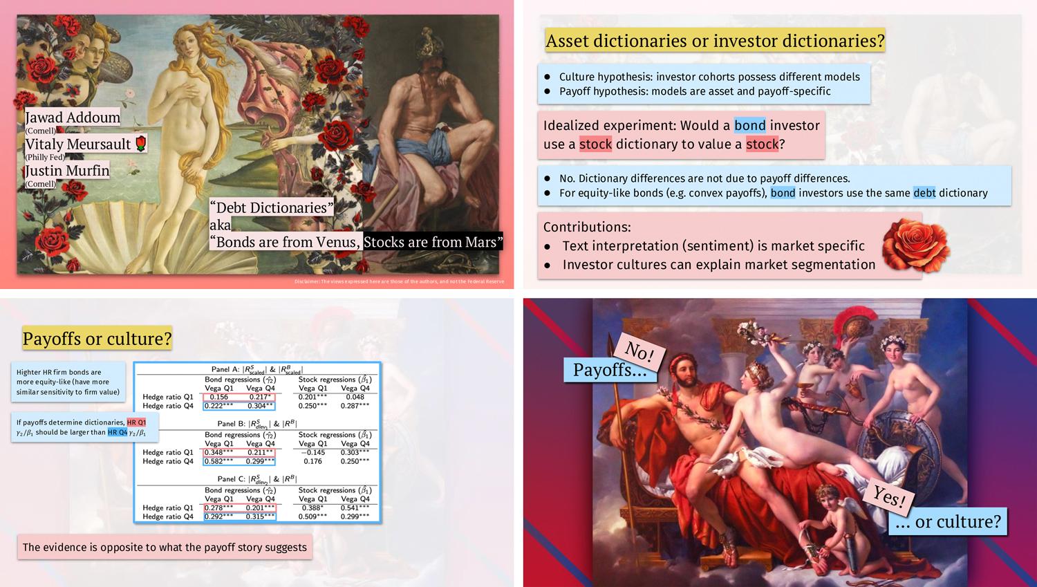
Vitaly Meursault: “Bonds are from Venus, Stocks are from Mars”
Vitaly is an economist at the Federal Reserve Bank of Philadelphia, where he conducts academic research in economics with a focus on machine learning and natural language processing.
| ✨ Aesthetic | fine arts / baroque / high-contrast / neobrutalism |
| 🎨 Colors | mustard yellow, rose, light blue, light coral, blue, grey |
| ✍️ Fonts | PT Serif (titles), Fira Sans (body) |
| 🛠️ Tools | PowerPoint, Pixelmator Pro, Midjourney |
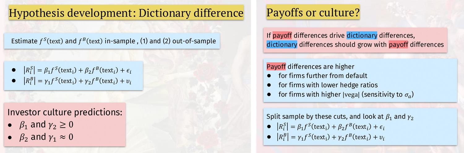
Slides”My presentation merges art across eras - from Botticelli’s ‘Birth of Venus’ and Velázquez’s ‘Mars Resting’ to contemporary works - unified by the exploration of contrasts, reflecting the paper’s focus on divergent investor worldviews. I combine the artworks with modernist elements inspired by neobrutalism, featuring text on pastel-colored blocks with drop shadows. The design uses a Mars-red and Venus-blue color scheme that both distinguishes between stocks and bonds and focuses the attention on the main takeaways. For key points, I incorporate additional design elements like crowns and roses, generated in Midjourney to match the classical artworks’ style.
The most challenging aspect was making dense tables with analysis results (a staple in my field) accessible and engaging. I addressed this through dynamic color highlighting in tables, using animated rectangles to guide attention to specific data points.”
Sofie Van Landeghem: “spaCy v3: Custom Trainable Component for Named Entity Relation Extraction”
I collaborated on these slides with Sofie and they were used in a video tutorial showing how to implement a named entity relation extraction component from scratch with spaCy and Thinc.
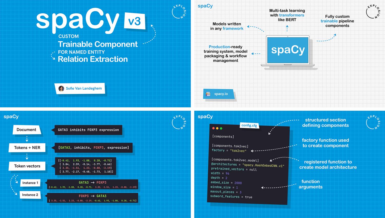
| ✨ Aesthetic | blueprint / drawing board / spaCy |
| 🎨 Colors | celestial blue, off-black, white, yellow-green, light red, magenta, cyan |
| ✍️ Fonts | Arial Rounded MT (body), HK Grotesk (accents), JetBrains Mono (code) |
| 🛠️ Tools | Keynote, Photoshop |
Slides Video”We used the blueprint style for all our ‘behind the scenes’ content about spaCy. The color scheme mirrors the spaCy blue and the slides also use the same fonts as the documentation. The most challenging part was to present a complex machine learning model implementation, and visualize matrix multiplication and how token vectors are composed.
To illustrate how the vectors flow through the model, we went with a color-coded approach, using an accessible palette of color pairs. This makes it easier to follow the vectors of two example tokens from the embedding step to the final classification layer that predicts a relation label. The implementations are presented as step-by-step flowcharts, with flexible arrows that can also be used to provide explanations along the way.”
Flowcharts and diagrams
Flowcharts and diagrams are my go-to design elements for explaining technical concepts and logic. They can be introduced step by step and use illustrations or icons as visual guides. Creating flowcharts can hugely benefit your talk, even before you present it: the process really forces you to break things down in simple terms. My personal rule of thumb: if the idea is too complex for a flowchart, it’s likely too complex in general and needs to be simplified before it can go into my talk.
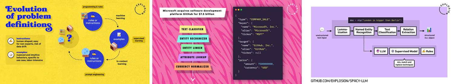
Many technical processes you’re trying to visualize are dynamic: something happens, code is executed in sequence, or data flows from A to B. Whenever you’re describing a process, consider if you can present it as a diagram instead of plain text. I often start by designing diagrams right after I’ve planned out my talk structure with statement slides.
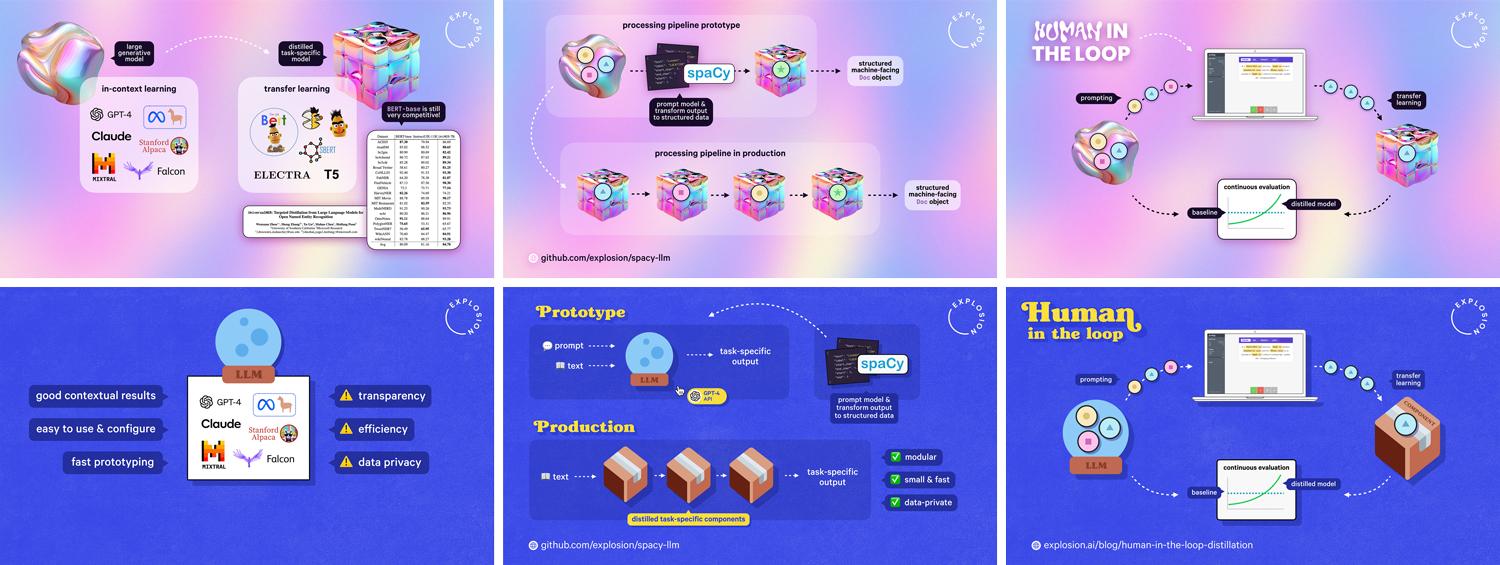
Associating elements with icons is another useful technique for making abstract concepts more visual. For example, several of my recent talks explain the process of human-in-the-loop distillation and the relationships between Large Language Models (LLMs) and distilled task-specific components. To illustrate this, I introduced different graphics (a blob or crystal ball, and a cube or package) representing those model types early on in the talk, which I then reference across the following slides.
Formulas and equations
Vitaly’s slides include great examples of mathematical equations, which are seamlessly embedded alongside the text. He used PowerPoint’s built-in support for inserting LaTeX and also added boxes in alternating colors to separate individual points, with matching text background colors to highlight key terms (which are also a nod to the Venus vs. Mars theme).
Depending on the content, there may be no way around using LaTeX via Beamer, which limits the design possibilities and makes complex styling more difficult. (Unfortunately, I can’t give advice here, since I don’t use it much.) However, you can always combine Beamer slides with your own designs created in a different program, and matching fonts and colors in your theme is relatively straightforward and ensures visual consistency.
Pro tip: If you’re less experienced with LaTeX, try using ChatGPT or Claude to generate it for you! Keynote and PowerPoint support inserting LaTeX out of the box and there’s an add-on for Google that should work in Google Slides. If you decide to go with images or screenshots instead, keep a close eye on the image quality and export in the highest reolution or, even better, as vector graphics (SVG).
Results and tables
Experiment results and figures can be an important part of your talk, but also challenging to present. In Vitaly’s slides, he used highlight colors and animated rectangles to guide attention to important data points, as well as boxes to add context. In some of my talks, I included speech bubbles to annotate rows, background colors to highlight individual figures and color-coded charts to visualize accuracy numbers.
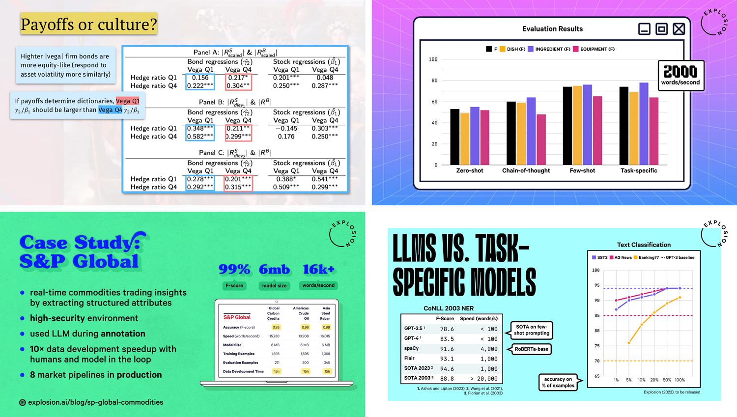
Rather than screenshotting tables from papers and other sources, I typically re-create them in Keynote so I have more styling flexibility. Most slide design tools also support different chart styles based on tabular data that can be animated to show one line or bar at a time. While charts can be great to visualize figures in comparison and in a style that matches your talk’s aesthetic, use them wisely. Just because something is visual, it doesn’t mean it’s easier to understand. (The Data Is Ugly subreddit has some great inspiration for what not to do!)
Code and pseudocode
The main purpose of showing code on a slide is to explain what’s happening and how it works. It doesn’t necessarily have to be executable. I’ve found that it’s generally fine to leave out boilerplate or use ellipses … if it simplifies the code and makes it easier to follow. Speech bubbles and arrows are good ways to annotate your code and provide more context. For other tips for presenting visually appealing code, see part 1.
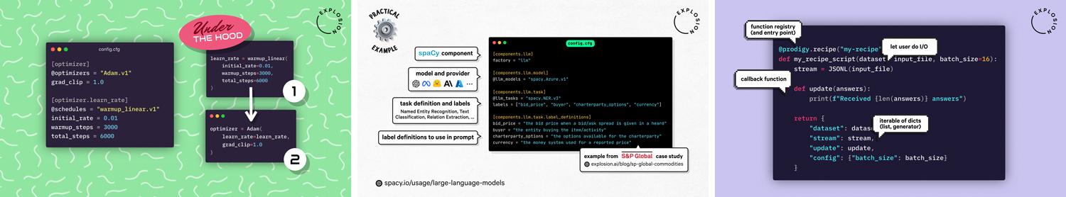
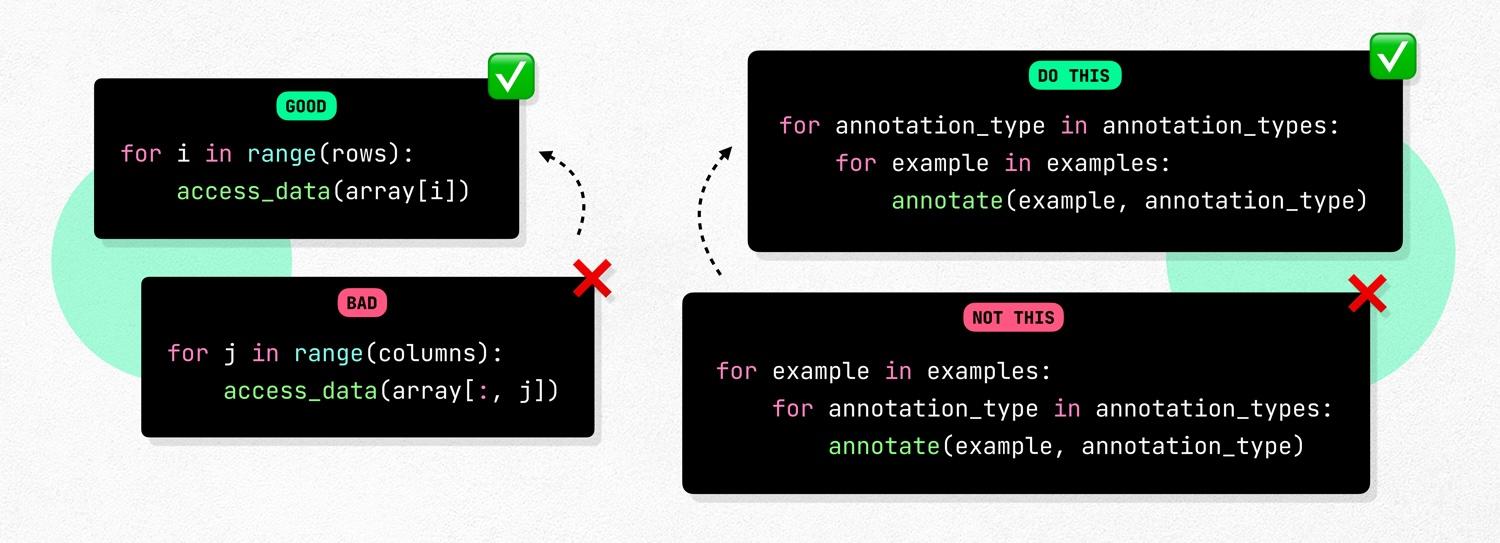
If you’re speaking to an audience of programmers, pseudocode can also be effective for describing logical concepts. After all, that’s what code was designed for! For example, in Matt’s talk about bootstrapping information extraction pipelines, we used for loops in Python to illustrate how to structure annotation workflows and reduce cognitive load for the annotator:
If your talk is very academic in nature, an aesthetics-based approach might simply not be a good fit, and that’s fine. But for many technical conference talks, sprinkling in a bit of your personality through visual elements can make your content more interesting and in turn, engage your audience and make it easier to get your points across.
P.S.: I really appreciate you all reaching out and sharing your slides inspired by my blog posts! If you’ve created your own slides, feel free to email me – I’d love to check them out 🖤
