A beginner’s guide to making beautiful slides for your talks
I’ve done quite a bit of conference speaking over the years, and I love designing slides and coming up with a new visual theme for each topic. It’s fun and keeps me motivated to put in the work and actually write my talks. People often ask me for tips and tooling recommendations, so in this guide, I’m sharing some of my not-so-secret secrets and three beginner-friendly steps for how you can up your slides game for the upcoming conference season!

Some of my slides designs over the years
Disclaimer (since this post also got widely shared outside of my circles): This blog post is not intended as a general-purpose guide to making universally good slides. It mostly collects some tips based on how I make my slides, which are quite specific and targeted to a certain type of conference, talk style and audience. I get a lot of questions from people who like my slides and want to do something similar for their talks, which is what inspired this post.
1. A good font can make a world of difference
Fonts are truly a secret weapon and it’s my number one recommendation for a quick and easy way to spice up your slides. Even if you do nothing else, a good font can add a lot of personality, and discovering new fonts is a lot of fun. (Just be careful because it can become very addictive – if you enjoy buying domains you don’t need, you’ll love shopping for fonts!).
Two recent sets of slides I made are almost entirely carried by their respective font: Mangrove Sans and Script for Matt’s talk on beating GPT-4 on predictive tasks, and Marjorie for my keynote on LLMs from prototype to production. I also took inspiration from the examples provided of the fonts in context and used some of them in the overall design to really use the fonts to their full potential.

Example of slides almost entirely carried by fonts
Of course, you don’t need to pick or buy a new font for every talk – if there’s a font you particularly like, it can become your “signature font” and it will give your slides a unique, but consistent look. For instance, I’ve been using GT Walsheim on this site since pretty much the beginning, and Calibre has been the primary font for most of my slides and Explosion’s websites for years.
Budget option: free fonts
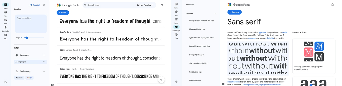
Over the years, Google Fonts has amassed a significant collection of free fonts you can try out in the browser and download for use in your project, and even find suitable font pairings for. If you’re looking for interesting fonts for slide titles, the “Display” category is a good one to start browsing through, and you can also define more fine-grained filtering. The site also provides a handy glossary that explains all relevant font terminology.
For a less curated and more hit-or-miss selection, there’s also Dafont, which offers over 80k and mostly free fonts including many niche types of styles.
Premium fonts
High-quality fonts available on sites like Fonts.com can sometimes get pretty expensive but marketplaces like Creative Market offer many great alternatives by independent creators, often for under $20 per font family. As a nice bonus, many font stores include not only plain examples of the font itself but also designs showing the font in use that you can take inspiration from.
")
Preview of fonts and design examples on Creative Market (#1, #2)
Remember that fonts are made by people and require significant design effort, so please don’t pirate them. You can always try them out interactively in your browser, and many fonts also offer free trial versions with limited character sets so you can test them in your project before you commit.
Pro tip: Get a font manager
The default font apps that come with standard operating systems aren’t particularly nice so if you’ve already downloaded a lot of fonts, it can be helpful to install a font manager with features for previewing, sorting, filtering, organising and activating your fonts. I use RightFont for Mac, which integrates with Google Fonts out of the box, and there’s also FontBase, which is free and supports Windows and Linux as well.
2. Focus on the most powerful editing features
You don’t need to become an expert at graphic design to make beautiful slides! I wouldn’t even consider myself a designer because there’s so much I can’t do and I rely a lot on existing design assets – the only advantage I have, really, is that I’ve been hacking around with Photoshop and web design since I was a teenager.
Using effects in Adobe Photoshop
Photoshop can be intimidating at first because there’s just so much that’s possible and so many tools and features. But once you have a basic grasp of the controls, moving things around, copy-pasting and working with layers (you can find many beginner tutorials online), there are really only two killer features you need to know to take your visuals to the next level: actions and smart objects.
Actions are essentially programmed workflows that perform a series of steps on your image. There are many cool effects you can buy and download from sites like Creative Market to transform images or text into cool designs in a single click.
")
Different Photoshop effects with examples available on Creative Market (#1, #2)
Smart objects are editable containers for images and text that are then used or transformed as part of a larger design – so basically, a Photoshop file within a Photoshop file. Many pre-made design assets come with smart objects that you can edit by double-clicking on the layer and saving when you’re done. A classic example of this are mockups: you copy your content into the smart object, and it’s transformed into a realistic-looking paper flyer, book or even an embroidered patch or enamel pin.
")
Mockups for realistic-looking patches and enamel pins using smart objects (#1, #2)
If you know how to use actions and make small edits in Photoshop, there’s an abundance of high-quality design assets and effects for all kinds of different styles to choose from online. You’ll also find many design packs or bundles that consist of different elements: seamless patterns for backgrounds, textures, effects, images, pre-designed vector graphics and sometimes even matching fonts. They also typically come with several examples that show what’s possible and are great for inspiration.
Working with colours
If you’re unsure which colours work well together, there are many tools for creating colour palettes, like Coolors, which is one of my favourites. You can generate random combinations, or add your existing colours, lock them in and generate a matching palette. There’s also uiGradients, which provides a collection of colourful gradients that can work well as backgrounds to give your slides a more designed touch.

The interactive Coolors palette generator and the uiGradients collection
If you’re creating graphs and visualisations, make sure your colours are clearly distinguishable and accessible for people with visual impairments. This guide has many helpful tips and infographics, as well as a generator for accessible colour palettes. As a general strategy, try to not solely rely on colour to get your point across – in addition, you can use style (like solid versus dotted lines), or emoji and icons (The Noun Project has an icon for everything!).
Pro tip: Presenting code with syntax highlighting
When presenting code on your slides, you want it to be clear and easily understood. Did you know that if you’re using Visual Studio Code, your syntax highlighting is automatically copied to your clipboard as well? If you paste it into an app like Keynote, the colours will be preserved and you’ll end up with out-of-the-box pretty code. The same might be true for other code editors as well, but I haven’t tried it.
Another option is to use images or screenshots, but be careful here: you can easily end up with lower image quality, which is especially problematic for text. For beautiful high-quality code screenshots, I recommend Carbon, which supports many languages, themes and customisations in a cool terminal-style look.

Examples of code with syntax highlighting presented in different styles
3. Less is more
Good design doesn’t mean “more stuff” – it’s often the opposite. When you discover the magic of design elements and effects, it can be tempting to go overboard, like many did with the introduction of Word Art and Clip Arts back in the 90s.
Slides should support your talk
Ultimately, what your talk is about is the content. Anything visual that you add is only there to support your points, keep your listeners interested and help them follow along. There’s a fine line between making your slides stand out and making them work against you.
You don’t want your audience to get distracted and stop paying attention to your talk because they’re busy processing the slides or reading long texts instead of listening. I personally prefer slides that only include short summaries of the main points and examples or illustrations, and only use them as a visual guide through what I’m saying while a slide is on. This means that the slides might not always be fully understood on their own and out of context, but I’m okay with that. (Of course, how you handle this depends a lot on the type of talk and venue. For academically-oriented talks, it can be common to include a lot more text and content, whereas keynote speakers at industry conferences may sometimes present with slides showing only supporting images.)
You don’t need fancy animations
Tools like Keynote and PowerPoint offer a lot of options for animating elements on your slides, but the only built-in animation I ever use is “appear”. Fancier animations can be nice as a little gag, but they’re not only distracting, they also come with a big disadvantage: they only work in your program. I typically export my slides with all animation steps as a PDF as a fallback, in case there are technical issues at the conference and I can’t use my laptop, and so I can upload them to Speakerdeck later. This won’t support animations anyway, so I don’t bother with them in the first place.
Pick a theme and stick to it
For my talks, I usually decide on a single theme or “aesthetic” that I use consistently across all slides as a visual through line, reflected in the headline fonts, colours, background and style of graphics and illustrations. For example, glitchy analog vibes, 80s, 70s, paper collage or a Y2K-inspired design. How playful you want to go with it is up to you, your personality and the type of event. If you feel good about your slides and style, it’ll show and will help you feel more comfortable on stage.
If you’re ever stuck on a slide and not sure how to present a piece of information, take a step back and ask yourself: What styles and elements does my theme and aesthetic have that could fit? Maybe it’s a ripped piece of paper if you’re going for a DIY vibe. Or maybe it’s an asymmetric box, or a browser window illustration with a strong shadow. Maybe your content works best on a minimalistic statement slide with a strong colour and no visual distractions. If you’re not sure, go with “less” instead of “more”.
Resources and tools I use
| 👩🎨 Design | Keynote, Adobe Photoshop, Adobe Illustrator, Figma, Sketch |
| ✍️ Fonts | Creative Market, Google Fonts, Dafont, RightFont, FontBase |
| 🎨 Colours | Coolors, uiGradients |
| 🖼️ Assets | Creative Market, Freepik |
| ℹ️ Icons | Apple Emoji, Twemoji, The Noun Project |
| 💻 Code | Carbon, Visual Studio Code |
| 🔗 Sharing | Speakerdeck |